Quest 62 - NEMORA

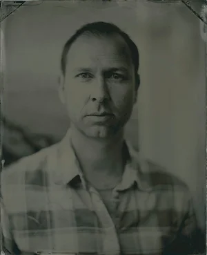
Image by Kate Cullen / Edited with Nemora 01 + Cambric + Somnus
Nemora holds its tones in a soft middle ground.
Blacks stop short of black, whites stop short of white, and a teal split tone holds through the shadows and the highlights at once. Greens cool toward sage. Rust and brick keep their warmth. The name is Latin for groves - not deep forest, the open kind, glades and pasture running through.
Built around three base presets on a single creative profile. They share the color and differ in surface, so the choice is about how the image should feel rather than how strong the look is.
NEMORA 01
The anchor. Whites pulled down in the curve, warm teal through the split, and a warm midtone that keeps skin clear of the cool cast. Start here.


Image by Kate Cullen / Edited with Nemora 01 + Cambric
NEMORA 02
The most atmosphere of the three. Softer clarity, more haze, and the strongest teal. Built for landscapes and anything with distance in it.


Image by Kate Cullen / Edited with Nemora 02 + Cambric + Somnus
NEMORA 03
The flattest and most matte. Heavier grain, softest curve, least contrast. For frames meant to feel like a print rather than a file.


Image by Sarah Adler of Mother & Wild / Edited with Nemora 03 + Somnus
The set also comes with a creative profile and three tools. The profile carries the color transform underneath all three grades, adjustable in both directions and usable on its own over an image you have already graded.
Cambric lays warm dappled light across the background and leaves the subject alone. Five layers, each on its own slider, so it runs from a suggestion to full afternoon sun.
Evenfall walks an image toward dusk. It pulls the blacks back down, so the shadows have somewhere to land.
Somnus softens. Sharpness, clarity and texture come off the brighter tones so they bloom instead of bite.
Each tool layers cleanly on top of the presets, or works on its own when you want the atmosphere without the full treatment.