Nemora
English countryside tones with a melancholic feel.
Nemora takes its name from the Latin for open woodland — the glades and shaded pasture where light arrives in pieces rather than all at once. Every preset carries teal at both ends of the range, shadows and highlights alike, set against a warm midtone that keeps skin honest while the landscape cools around it.
Built around three base presets and a dedicated creative profile, Nemora gives you a foundation grade with whites that stop short of white and greens that cool toward sage without giving up their colour — ready to shape to your own vision, with three tools that extend the look further.
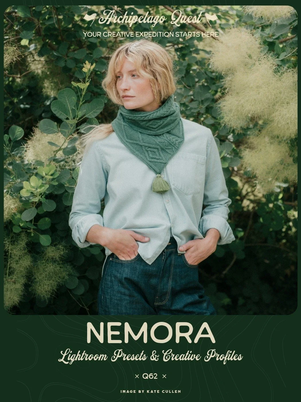
English countryside tones with a melancholic feel.
Late summer downland. The color's starting to fade from the fields, the hedgerows have dulled, and mist sits in the folds of the hills and doesn't lift. Blacks and whites pulled back in the curve, the warmth held in the middle, where the light still reaches. Nemora is Latin for groves, the open kind, glades and pasture with warm light falling through the leaves overhead.
Nemora Creative Profile: Greens cooling toward sage without giving up their color, rust and brick holding their warmth while everything around them lets go, and a steel blue running through the shadows and the highlights alike.
Nemora 01 is the anchor. Warm teal, whites pulled down in the curve, and a warm midtone that holds skin clear of the cool cast. Start here. Nemora 02 carries the most atmosphere. Softer clarity, more haze, the strongest teal of the three. Best on landscapes and anything with distance in it. Nemora 03 is the flattest and most matte. Heavier grain, softest curve, least color. For frames you want to feel like a print rather than a file.
Cambric lays warm dappled light across the background and leaves your subject alone. Five layers, each on its own slider, so you can take it from a suggestion to full afternoon sun. Named for the fine white linen in Scarborough Fair. Evenfall takes the image toward dusk. It pulls the blacks back down, so shadows have somewhere to land. Somnus softens. Sharpness, clarity and texture come off the brighter tones so they bloom instead of bite.

English countryside tones with a melancholic feel.
Late summer downland. The color's starting to fade from the fields, the hedgerows have dulled, and mist sits in the folds of the hills and doesn't lift. Blacks and whites pulled back in the curve, the warmth held in the middle, where the light still reaches. Nemora is Latin for groves, the open kind, glades and pasture with warm light falling through the leaves overhead.
Nemora Creative Profile: Greens cooling toward sage without giving up their color, rust and brick holding their warmth while everything around them lets go, and a steel blue running through the shadows and the highlights alike.
Nemora 01 is the anchor. Warm teal, whites pulled down in the curve, and a warm midtone that holds skin clear of the cool cast. Start here. Nemora 02 carries the most atmosphere. Softer clarity, more haze, the strongest teal of the three. Best on landscapes and anything with distance in it. Nemora 03 is the flattest and most matte. Heavier grain, softest curve, least color. For frames you want to feel like a print rather than a file.
Cambric lays warm dappled light across the background and leaves your subject alone. Five layers, each on its own slider, so you can take it from a suggestion to full afternoon sun. Named for the fine white linen in Scarborough Fair. Evenfall takes the image toward dusk. It pulls the blacks back down, so shadows have somewhere to land. Somnus softens. Sharpness, clarity and texture come off the brighter tones so they bloom instead of bite.
Claim this set with one monthly credit — enter your credit code at checkout and the $38 drops to zero. The full collection, yours to keep forever. Rather not use a credit? It's $38 at checkout without one.
"This set covers all the bases in a beautifully subtle way, proving that sometimes less is more. Each preset changes just enough that you can achieve your vision without any unnecessary fluff, with the creative profile slider letting you dial in exactly what you want out of the scene. My favorite extra within the set would have to be Cambric, as it adds exactly what I look for when refining each image. Overall, this set is versatile enough to be used for not only sun kissed portraits, but beautiful summer memories."
"Nemora is a lovely set. It has quickly become one of my favorite sets. It captures the organic behavior of physical film stock remarkably well — lifting the shadows so blacks retain texture without feeling crushed, and gently rolling off highlights into creams rather than clipping them. What stands out most in the color profile is how it handles foliage and greens. It pulls aggressive yellow-greens toward moody teal and olive hues, perfectly complementing warm skin tones for a cohesive, understated teal-and-orange grade. It gives photos an effortless, high-end motion picture aesthetic without being too heavy-handed or stylized."
Nemora in the Wild
Examples from photographers around the world. Hover to pause, drag to explore.


