Inspiration: Wes Anderson Style
There’s no denying that Wes Anderson’s aesthetic style has permeated the photography world for over a decade. The whimsical tonal palette, bold colors, and curious characters are certainly captivating to the eye! With summer in full swing, plus new Wes Anderson trends going around social media, we’re seeing lots of Wes inspiration!
Since Asteroid City, Wes Anderson’s newest film, just released, we’ve got a round-up of some of the defining characteristics of Wes Anderson’s visual cinematic style to inspire your next photoshoot!
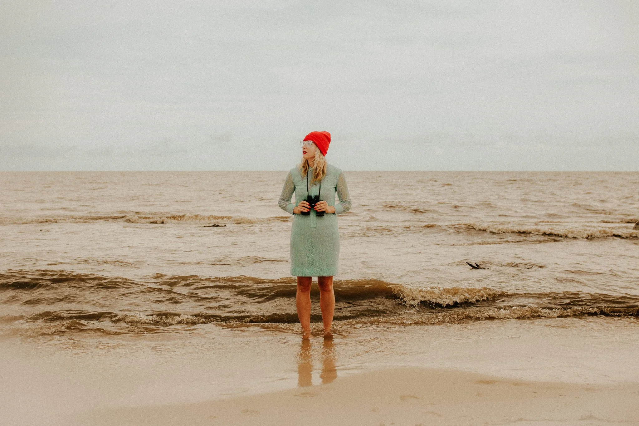
Symmetrical Framing
Perhaps the most obviously imitable aspect of Wes Anderson’s style is his use of symmetrical compositions! By using centered subjects or evenly spaced subjects, you can create a sense of harmony and balance in frame.
TIP: Straighten or auto-transform any architecture in your photo for even more of a symmetrical effect!
Image by Kewin Connin Jackson
Edited with Quest 08 Nomad SE and Sky Blue from the AI Toolset
Image by Darla Winn
Edited with Quest 18 Arbor, Subject Pop, Tone Mask 1, Sky Blue and Sky Saver from AI Toolset
Bonus tip: When centering your subject, use the keyboard shortcut O in Lightroom to change your crop guidelines (they will cycle through several different guideline configurations)— some will be more helpful in finding the center of the photo than others!
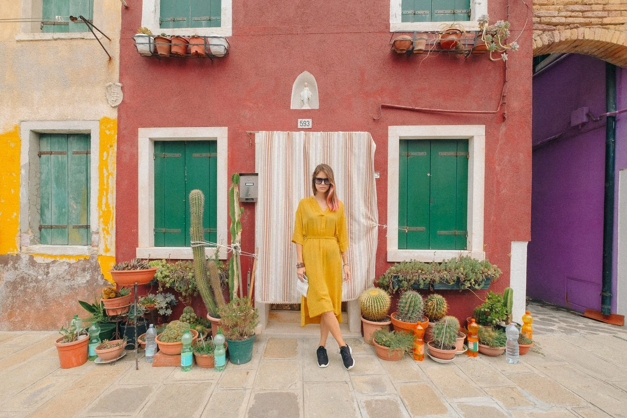
Pastel Color Palette
Wes Anderson films feature a carefully curated and stylized color palette characterized by pastel hues. This palette contributes to the whimsy and nostalgia of the world his stories take place in.
Image by Bogdan Babanin
Edited with Quest 15 Opalescent
Image by Bogdan Babanin
Edited with Quest 15 Opalescent
Tip: For that easily recognizable yellow/warm Wes Anderson overtone in one-click, use one of the Oxidized presets from ORE Presets!
Image by Darla Winn
Edited wth Quest 15 Opalescent plus Oxidized 6 from ORE Presets
Quirky Subjects
Wes Anderson’s films are known for their eccentric characters, each with unique traits and quirks that are visible right away in their costume, makeup, expression, or props.
These quirky qualities can be used in still photography to give your subjects a ton of personality and visual interest!
Image by Francesco Rossi
Edited with Quest 15 Opalescent, Dorado from Quest 26 ZIA, and Aged Paper Tone from Quest 25 Fable
Image by Darla Winn
Edited with Quest 08 Nomad SE, Dorado from Quest 26 ZIA
Locations as Characters
Wes Anderson’s films feature some of the most magnificent production designs and locations— the charming settings almost feel like they are characters themselves! Inject tons of personality into your images by seeking out interesting locations to photograph on their own (see the Accidentally Wes Anderson IG page for inspo) or with your subjects.
Image by Bogdan Babanin
Edited with Quest 15 Opalescent
Image by Darla Winn
Edited with Quest 18 Arbor and 🌈 from Quest 22 Glacial
Learn to edit like Wes Anderson in 60 Seconds using Archipelago and Quest Presets!!
Check out this 60-second edit using Archipelago Presets, Creative Profiles and tools to replicate the whimsical colors most commonly seen in Wes Anderson movies.
Image by Lis Warren
What is your favorite Wes Anderson movie? Tell us in the comments!


