Editing Greens in Photos
Image by Yulia Lytkina
Edited with Quest 45 Atelier
Greens—they are among the most challenging elements for photographers to edit, particularly when photographing vibrant neon green grass or foliage.
Green hues are one of the most frequently asked-about topics when it comes to post-processing. From overly electric lawns to green bounce on skin tones, photographers often struggle to find the right balance that feels natural, timeless, and true to their style.
In this article, we’ll explore how light and time of day affect green tones, which panels and sliders in Lightroom can be used to correct or dramatically shift their feel, and how creative tweaks can bring cohesion to your overall color story. By understanding how to manipulate greens thoughtfully, you’ll learn how to make them work for you, not against you—enhancing your images rather than distracting from them.
How does changing the green hues in your photo affect the feeling and mood of the image?
For most of us photographing outdoors, greens are the dominant color in nature— and even in desert landscapes, greens appear in cacti and other plants. Greens look different at various times of the day, in different lighting, and during different seasons, so manipulating the hues can drastically alter your photo.
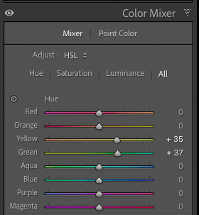
Tip: Most of the time, the hues that appear green in an image are actually both green and yellow, so you’ll need to shift both in the Hue slider of your HSL panel in Color Mixer in Lightroom.
For warmer greens, shift G+Y hues left
Mood: Energizing, fresh, sunlit, inviting, cozy
Feels like late summer or fall in extremes, or spring when shifted in moderation
Often used for earthier edits to make the image overall feel warm
For cooler greens, shift G+Y hues right
Mood: Calm, moody, introspective, serene
Feels like early morning, twilight, shade, or post-rain atmosphere
Often used for filmic edits to mimic film stock’s minty greens or for cinematic edits
Image by Michaela Sonntágová
Edited with Quest 47 Frontier
The above image is only edited with the preset, and below they have different hue shifts for green and yellow. One has the hues shifted left, warmer towards yellow, and the other has the hues shifted right, cooler towards blue.
Image by Michaela Sonntágová
Edited with Quest 47 Frontier with green and yellow shifted left in hue
Image by Michaela Sonntágová
Edited with Quest 47 Frontier with green and yellow shifted right in hue
Archipelago Preset tools for one-click green hue editing:
Light & Truth includes Green Tone 1-4 with options for different green hues
Limited Release Chroma Presets includes Spectrum Shift tools for all of the common hue shifts, including Yellow & Green
How does the time of day affect the greens?
Time of day has a significant impact on how greens appear in photography, due to changes in light temperature, direction, and intensity.
Image by Vanessa Tellez
Edited with Quest 47 Frontier
Golden Hour:
Light temperature is warm and soft, greens appear warmer with yellowish hues
The mood is more romantic, glowy, and nostalgic
Shadows are long and gentle, making greens appear richer and more dimensional
Midday:
Light temperature is cool and neutral, greens appear more vibrant but also harsh
Mood is bright, energetic, and high contrast
The harsh light can cause overexposed greens and yellows on shiny leaves or grass and there is much less subtlety to the hues and colors
Overcast or Cloudy:
The light temperature is cooler, diffused, and low contrast. Greens can shift to muted and bluish tones
Mood is soft, moody, and greens are more evenly lit
The colors in overcast light are more balanced and subdued, and the lower contrast gives you more detail and texture in foliage
Blue Hour:
Light temperature is overall cooler and blue, with greens shifting to desaturated blueish tones
The mood is quiet, introspective, and cinematic
Blue hour is great for creating emotional depth or mysterious feelings
The image below was taken in harsh light, and the greens and yellows are very bright and overexposed. Using the HSL panel in Color Mixer in Lightroom, the green and yellow sliders have been desaturated and also reduced in luminance to give them a softer, less jarring appearance. Doing this makes the image feel more like soft afternoon light instead of bright noon sun.
Image by Yulia Lytkina
Edited with Quest 45 Atelier
Image by Yulia Lytkina
Edited with Quest 45 Atelier with Saturation and Luminance adjustments
Which panels in Lightroom can greens be edited in?
There are several different places in Lightroom where you can edit greens in your images, and which one you use depends on what result you want.
The Point Color Panel adjustments made to the image below
The Color Mixer Panel: The HSL panel in Lightroom can now be found under Mixer, and Color Mixer also includes the Point Color panel
The HSL panel (Mixer) is the most common place to manipulate the hue, saturation, and luminance of colors in your images. It’s extremely versatile and usually the only place you’ll need, but it only works for the whole image and is not currently available to use in Lightroom’s masking panel options.
The Point Color panel uses an eyedropper to pick out a specific color you want to manipulate. You can then adjust the Range of the color to make it more specific to affect a smaller range of colors or broader to affect more color tones in the image. Hue, Saturation, and Luminance shifts in the Point Color panel affect only the specific color or color range you selected. There is also Point Color available in the Masking area, so you can apply the adjustments to masks rather than your whole image.
Tip: Use a Point Color Subject Mask to reduce green tints that have reflected on your subject.
Image by Jana Vozárová Photography
Edited with Quest 47 Frontier
Image by Jana Vozárová Photography
Edited with Quest 47 Frontier with Point Color adjustments to Hue, Saturation, and Luminance
White Balance: Temp and Tint can be adjusted to fix a wide range of issues stemming from too much green tint in an image— like when you are photographing in a forest or area with a lot of green grass that reflects onto your subjects. You can use the WB eyedropper (White Balance Selector) to select a neutral area of your image to automatically adjust the Temp and Tint, adjust them manually until it looks correct to your eye, or use Auto WB to get a good starting point and correct it from there.
In the example below, the straight out of camera Temp and Tint looks too cool and green, and using Auto WB it corrects them to give a good base to start editing with a preset or other adjustments. This is why we suggest correcting your exposure and white balance before starting to edit with a preset— a good base will give you a better idea of what the colors are supposed to look like when manipulated by a preset.
Image by Ernesto Villalba
Image by Ernesto Villalba
Tip: Use the masking panel to make specific Temp and Tint adjustments instead of global ones!
The Color Grading panel for Color Grade 3 from Odeon
The Color Grading panel makes global edits to add color to Midtones, Shadows, and Highlights in your images. Often, color grading is used for more creative and cinematic editing, adding subtle color to give images a different mood and feeling or overall tinge of color.
Many of our presets use the Color Grading panel to inject color for a signature look. For example, in Quest 23 Odeon, the set includes 3 Color Grades that inject different color combinations in your image. Color Grade 3, for instance, adds a warm orange to the midtones and green to the shadows.
The Tone Curve in Lightroom is a powerful tool that allows you to fine-tune the brightness and contrast of your image by adjusting tones across the shadows, midtones, and highlights using anchor points and the curve itself. There are also Tone Curve channels for color that are opposite (digitally): Red/Cyan, Green/Magenta, and Blue/Yellow. You can use Tone Curve to tint shadows or highlights with these colors.
Rather than affecting the greens outright, the Color Grading and Tone Curve panels manipulate the colors in the highlights, midtones, and shadows of images, which can be useful to help counteract or complement green in your images.
Image by Kaya Amaranth
Edited with Quest 23 Odeon
Hue Slider in the Masking Panel: After applying a mask in Lightroom, new panels appear that you can manipulate to adjust that mask. One is the Color Panel, and in it is a slider called Hue where you can make global adjustments to the Hue of colors in your mask.
Use Fine Adjustment can be ticked on or off to control the subtlety of the adjustments and sensitivity of the slider. The Hue slider can be extremely useful to correct greens reflected on skintones or clothing of your subject, since it is applied to masks. Add slight magenta hue by moving the slider to the left to correct for overly green skin or clothing.
Liam goes into detail about how to use the Hue slider in masks in the below Archipelago Edits: Greens Live Stream— that edit starts at minute 22:50 specifically, but the whole video is great for tips on editing greens!
Quest Presets with tools for editing greens:
Quest 32 Zalea includes Point Color presets
Quest 25 Fable includes one-click Foliage masks for Cool Mint and Forest Green
Mastering greens in your photography means learning how to control and shape them to support your creative vision. Whether you want to tone down harsh neon grass, create a soft and earthy palette, or enhance the natural vibrance of a landscape, understanding how greens behave under different lighting conditions and how to refine them in post-processing is key.
With the right tools and a thoughtful approach, greens can become one of the most powerful elements in your work—adding depth, harmony, and mood rather than pulling attention away. So the next time you sit down to edit, don’t shy away from those tricky greens. Embrace them, shape them, and let them elevate your images.
What are your favorite ways to edit greens in your photos? Let us know in the comments!